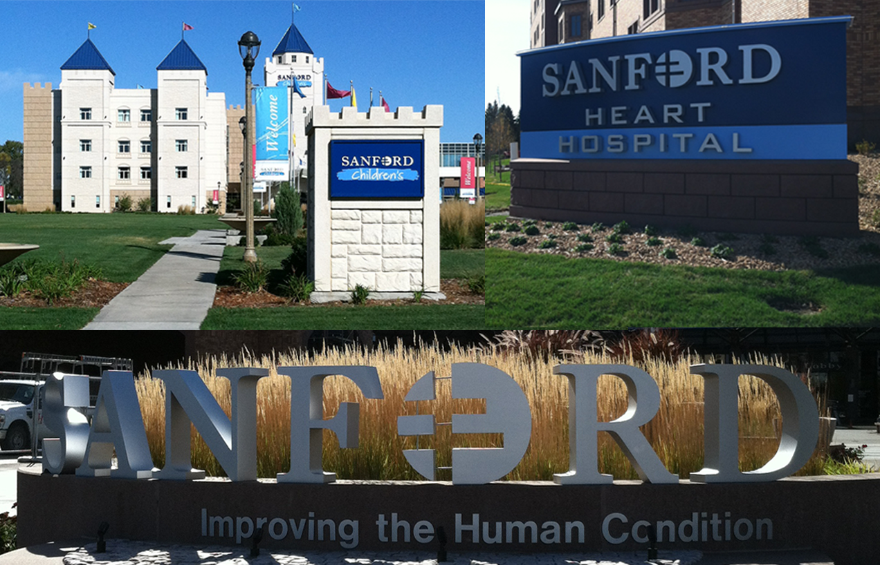
When Sioux Valley Health changed their name, they needed a rebrand to introduce the new name and update their mark. Capsule was challenged to incorporate the historic brand elements from the original mark while highlighting the new strength of the name.
The Lorraine cross was a pivotal piece of the original Sioux Valley Health logo and needed to be expressed in the new wordmark. A heart was present in the original but after rounds of ideation we felt it was an outdated icon and did not communicate Sanford effectively. The chevron from the Sioux Valley Health logo represented just that, the Sioux valley of the area.
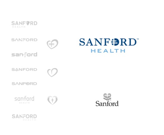
With the name change, the valley was no longer an important brand element. With this research, we began ideation on a series of wordmarks that featured the Lorraine cross in modern and new ways, often playing on the negative space of the letterforms. We worked to create an effective use of the cross inside the O of the name.
This logo work was created while working at Capsule for its client,
Sanford Health.
