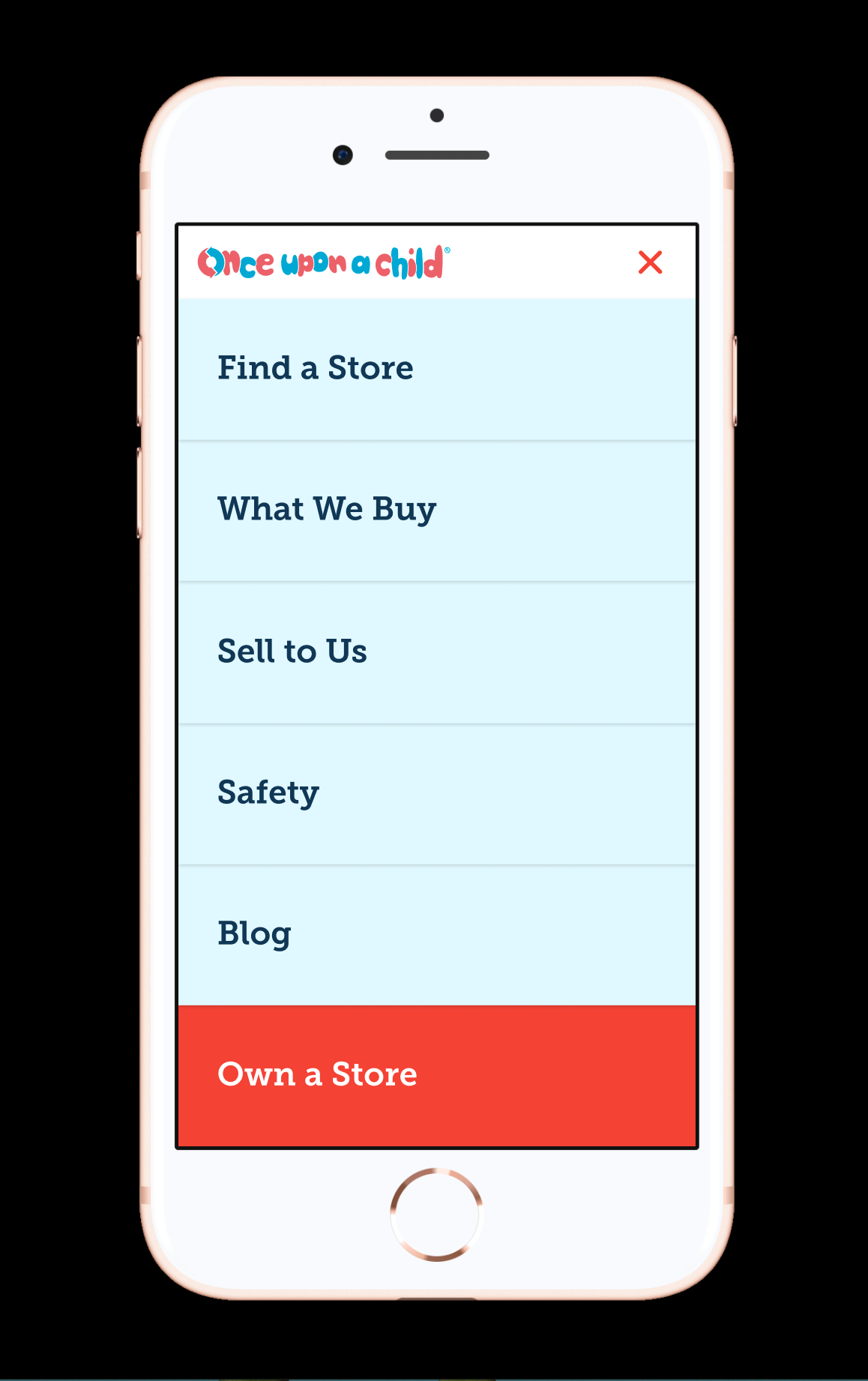
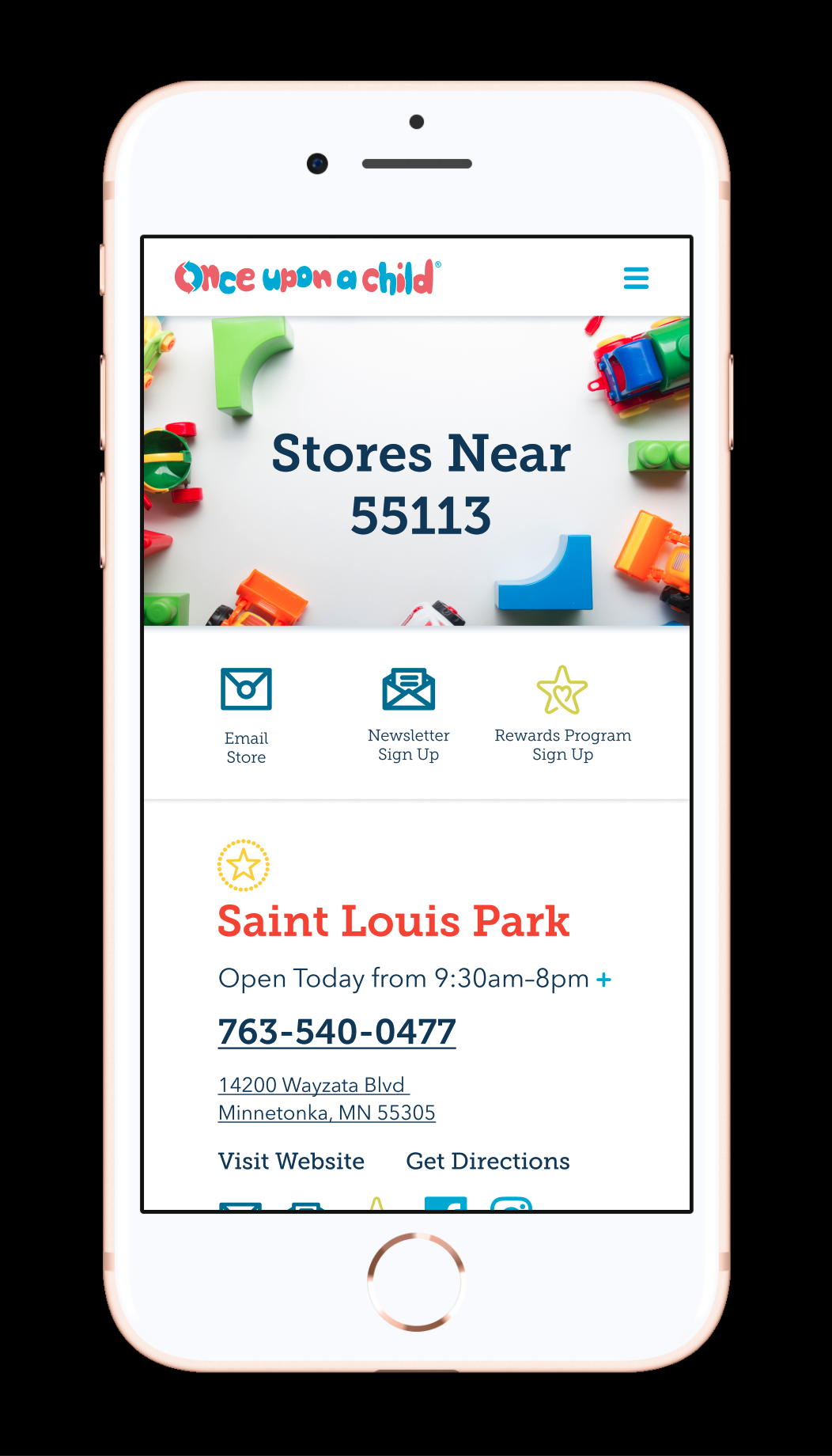
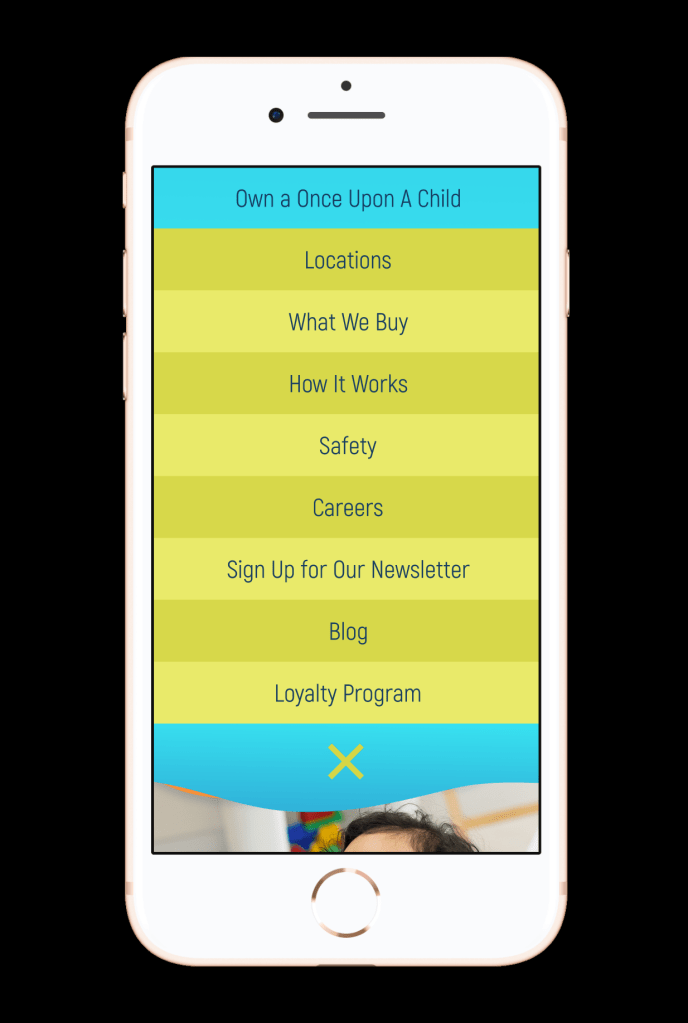
The Once Upon A Child website was in need of a full redesign as they had recently updates the interiors of their stores. They asked for a fresh, mobile first design.
As a challenge, I opted to try a new app called Figma. It was described as Sketch’s cooler younger brother. I’d tried Sketch a few times in the past and wanted to see what was new. As expected, it was a steep learning curve but I knew it would speed up my process in prototyping. Long story short, I loved it for web design.
After meeting with the client, I dug into their competition and brands they aspired to be. From there I put together a simple moodboard to discuss. Next, I dove into concepting.
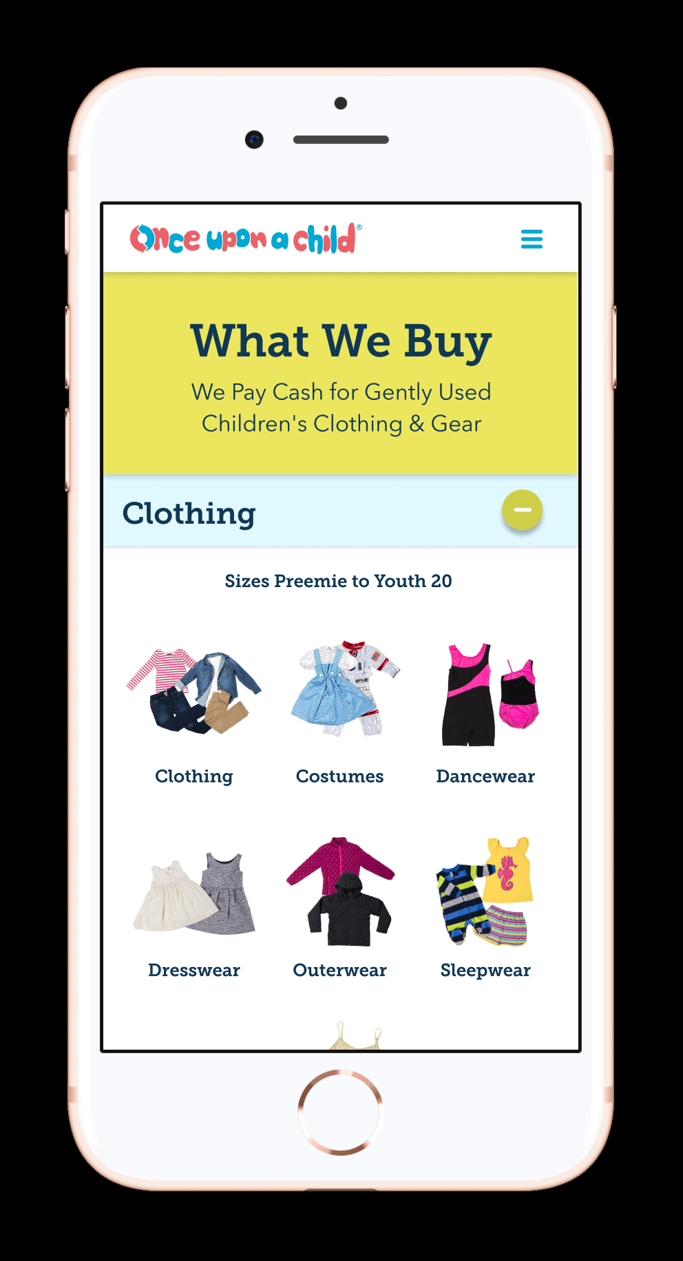
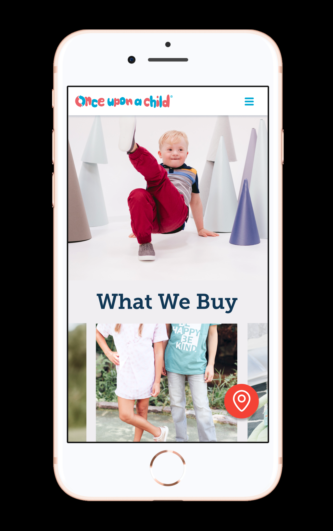
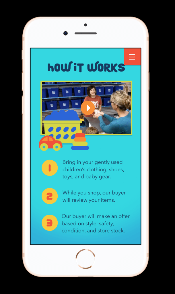
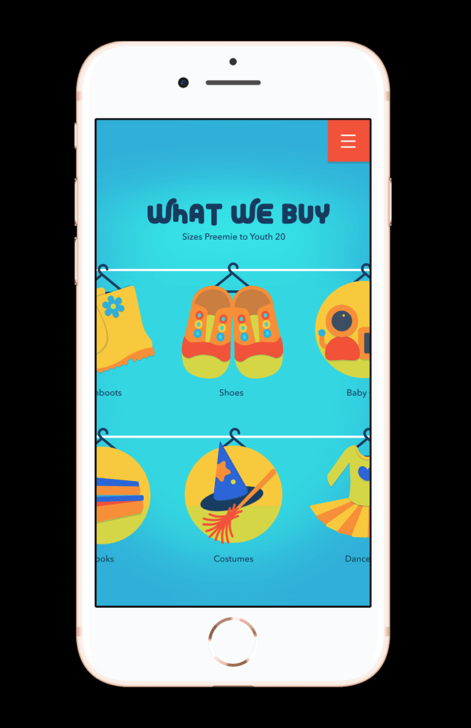
The chosen concept really highlights their photography and youthful attitude. In addition to the design and typeface choices, I needed to create custom icons and trim out all of the different What We Buy imagery.

Below are two alternate options. They didn’t make it out of the concepting phase but they show how a typeface and illustration style can really change how the messaging is presented.


P.S. Here’s a shot of my artboard. Keepin’ it organized.

All Once Upon A Child pieces were created while working at
Treefort for its client, Winmark Corporation.

Nice blogg thanks for posting